Fiber Optics Academy
Fiber Optics Academy
Client
Client
Fiber Optics Academy
Fiber Optics Academy
Role
Role
UX/UI Designer
UX/UI Designer
Year
Year
2023/2024
2023/2024
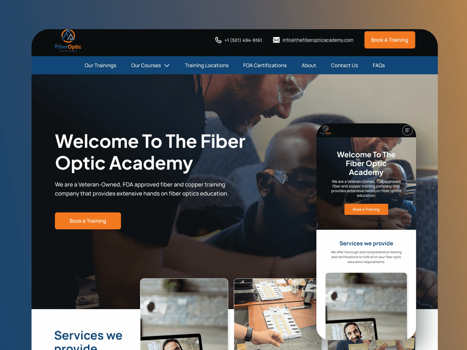
The Fiber Optic Academy website needed a revamp to enhance its user experience, improve navigation, and align its design with modern e-learning standards. The primary goals were to increase course signups, simplify content access, and provide a seamless, user-friendly interface for both prospective and enrolled students.
The Fiber Optic Academy website needed a revamp to enhance its user experience, improve navigation, and align its design with modern e-learning standards. The primary goals were to increase course signups, simplify content access, and provide a seamless, user-friendly interface for both prospective and enrolled students.
The Fiber Optic Academy website needed a revamp to enhance its user experience, improve navigation, and align its design with modern e-learning standards. The primary goals were to increase course signups, simplify content access, and provide a seamless, user-friendly interface for both prospective and enrolled students.
Team
Team
Founder • Software Engineer • UX/UI Designer (me)
Founder • Software Engineer • UX/UI Designer (me)
Responsibilities
Responsibilities
Web Design • Visual Design • Comparative Analysis • Conversion Optimization • SEO Optimization • Responsive Web Design
Web Design • Visual Design • Comparative Analysis • Conversion Optimization • SEO Optimization • Responsive Web Design
Impact
Impact
• 40% increase in course enrollments within the first 3 months post-launch. • 25% improvement in mobile user engagement (time spent on site). • Bounce rate reduced by 20%.
• 40% increase in course enrollments within the first 3 months post-launch. • 25% improvement in mobile user engagement (time spent on site). • Bounce rate reduced by 20%.
Overview
Overview
Overview: The Fiber Optic Academy website needed a revamp to enhance its user experience, improve navigation, and align its design with modern e-learning standards. The primary goals were to increase course signups, simplify content access, and provide a seamless, user-friendly interface for both prospective and enrolled students.
Overview: The Fiber Optic Academy website needed a revamp to enhance its user experience, improve navigation, and align its design with modern e-learning standards. The primary goals were to increase course signups, simplify content access, and provide a seamless, user-friendly interface for both prospective and enrolled students.
Overview: The Fiber Optic Academy website needed a revamp to enhance its user experience, improve navigation, and align its design with modern e-learning standards. The primary goals were to increase course signups, simplify content access, and provide a seamless, user-friendly interface for both prospective and enrolled students.
Client
Client
Fiber Optics Academy
Fiber Optics Academy
Industry
Industry
Engineering & Construction
Engineering & Construction
Service
Service
Responsive Web Design
Responsive Web Design
Conversion Optimization
Conversion Optimization
UI Design
UI Design
Product Design
Product Design
Website UX Audit & Revamp
Website UX Audit & Revamp
Duration
Duration
3 Weeks
3 Weeks


The Challenge
The Challenge
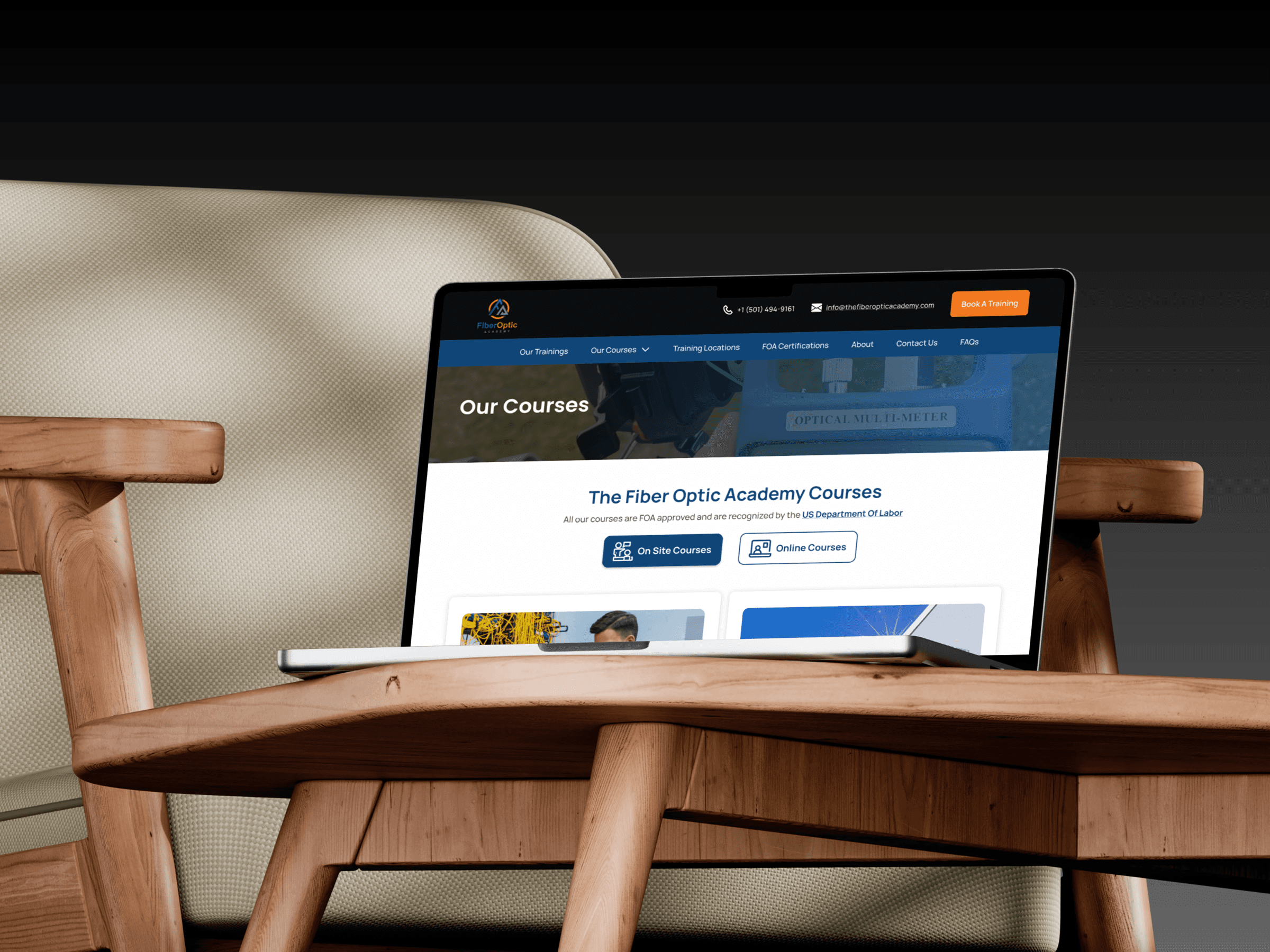
The existing website faced several challenges: - Confusing Navigation: Users struggled to find course offerings and key information. - Outdated Design: The interface lacked visual appeal and did not reflect the academy's forward-thinking mission. - Mobile Unfriendliness: The site’s responsiveness was limited, leading to poor usability on mobile devices. - Low Conversion Rates: Visitors were not easily converting into signups or inquiries due to unclear CTAs (calls-to-action).
The existing website faced several challenges: - Confusing Navigation: Users struggled to find course offerings and key information. - Outdated Design: The interface lacked visual appeal and did not reflect the academy's forward-thinking mission. - Mobile Unfriendliness: The site’s responsiveness was limited, leading to poor usability on mobile devices. - Low Conversion Rates: Visitors were not easily converting into signups or inquiries due to unclear CTAs (calls-to-action).
The existing website faced several challenges: - Confusing Navigation: Users struggled to find course offerings and key information. - Outdated Design: The interface lacked visual appeal and did not reflect the academy's forward-thinking mission. - Mobile Unfriendliness: The site’s responsiveness was limited, leading to poor usability on mobile devices. - Low Conversion Rates: Visitors were not easily converting into signups or inquiries due to unclear CTAs (calls-to-action).
Product Discovery & Design Strategy
Product Discovery & Design Strategy
Research - Objective: To identify pain points and opportunities for improvement - Research Methods: - User Interviews: Conducted interviews with 10 current students and 5 prospective students to understand their needs and frustrations. - Heuristic Evaluation: Audited the current site for usability issues. - Competitor Analysis: Analyzed design and features of leading e-learning platforms. - Analytics Review: Examined website metrics to understand user behavior and drop-off points. Key Findings: 1. Users wanted clear navigation and fewer steps to enroll in courses. 2. Prospective students valued testimonials and course previews but found them hard to access. 3. Mobile users accounted for 60% of traffic but faced significant usability issues. 4. The visual design felt outdated, reducing user trust. Process - 1. Define Goals - Primary Goal: Increase course enrollments by 30% in six months. - Secondary Goals: - Improve the mobile experience. - Simplify navigation and highlight key CTAs. - Refresh the visual design to enhance trust and engagement. 2. Ideation and Wireframing - Created low-fidelity wireframes to experiment with layouts for the homepage, course catalog, and enrollment process. - Focused on a simple, intuitive navigation structure with clear hierarchies. 3. Prototyping and Testing - Developed high-fidelity prototypes using Figma, incorporating feedback from stakeholders and users. - Conducted usability testing with the client and a sample 4 prospective students, iterating based on their feedback. 4. Visual Design - Adopted a modern, clean aesthetic with a professional color palette inspired by fiber optics cables (blues, whites, and accents of orange). - Updated typography for readability and professionalism. - Designed custom icons and visuals to represent courses and certifications.
Research - Objective: To identify pain points and opportunities for improvement - Research Methods: - User Interviews: Conducted interviews with 10 current students and 5 prospective students to understand their needs and frustrations. - Heuristic Evaluation: Audited the current site for usability issues. - Competitor Analysis: Analyzed design and features of leading e-learning platforms. - Analytics Review: Examined website metrics to understand user behavior and drop-off points. Key Findings: 1. Users wanted clear navigation and fewer steps to enroll in courses. 2. Prospective students valued testimonials and course previews but found them hard to access. 3. Mobile users accounted for 60% of traffic but faced significant usability issues. 4. The visual design felt outdated, reducing user trust. Process - 1. Define Goals - Primary Goal: Increase course enrollments by 30% in six months. - Secondary Goals: - Improve the mobile experience. - Simplify navigation and highlight key CTAs. - Refresh the visual design to enhance trust and engagement. 2. Ideation and Wireframing - Created low-fidelity wireframes to experiment with layouts for the homepage, course catalog, and enrollment process. - Focused on a simple, intuitive navigation structure with clear hierarchies. 3. Prototyping and Testing - Developed high-fidelity prototypes using Figma, incorporating feedback from stakeholders and users. - Conducted usability testing with the client and a sample 4 prospective students, iterating based on their feedback. 4. Visual Design - Adopted a modern, clean aesthetic with a professional color palette inspired by fiber optics cables (blues, whites, and accents of orange). - Updated typography for readability and professionalism. - Designed custom icons and visuals to represent courses and certifications.
Research - Objective: To identify pain points and opportunities for improvement - Research Methods: - User Interviews: Conducted interviews with 10 current students and 5 prospective students to understand their needs and frustrations. - Heuristic Evaluation: Audited the current site for usability issues. - Competitor Analysis: Analyzed design and features of leading e-learning platforms. - Analytics Review: Examined website metrics to understand user behavior and drop-off points. Key Findings: 1. Users wanted clear navigation and fewer steps to enroll in courses. 2. Prospective students valued testimonials and course previews but found them hard to access. 3. Mobile users accounted for 60% of traffic but faced significant usability issues. 4. The visual design felt outdated, reducing user trust. Process - 1. Define Goals - Primary Goal: Increase course enrollments by 30% in six months. - Secondary Goals: - Improve the mobile experience. - Simplify navigation and highlight key CTAs. - Refresh the visual design to enhance trust and engagement. 2. Ideation and Wireframing - Created low-fidelity wireframes to experiment with layouts for the homepage, course catalog, and enrollment process. - Focused on a simple, intuitive navigation structure with clear hierarchies. 3. Prototyping and Testing - Developed high-fidelity prototypes using Figma, incorporating feedback from stakeholders and users. - Conducted usability testing with the client and a sample 4 prospective students, iterating based on their feedback. 4. Visual Design - Adopted a modern, clean aesthetic with a professional color palette inspired by fiber optics cables (blues, whites, and accents of orange). - Updated typography for readability and professionalism. - Designed custom icons and visuals to represent courses and certifications.
The Solution
The Solution
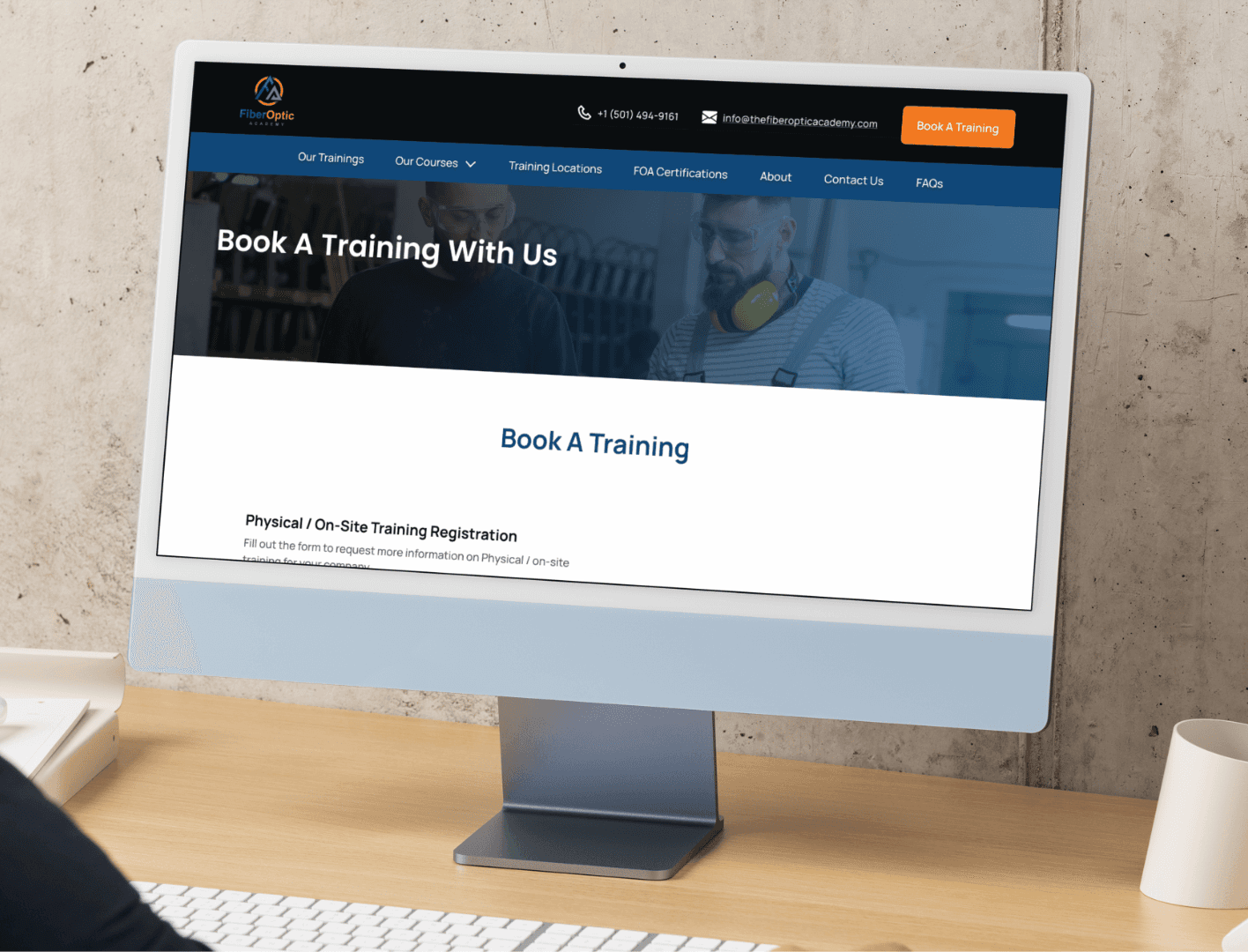
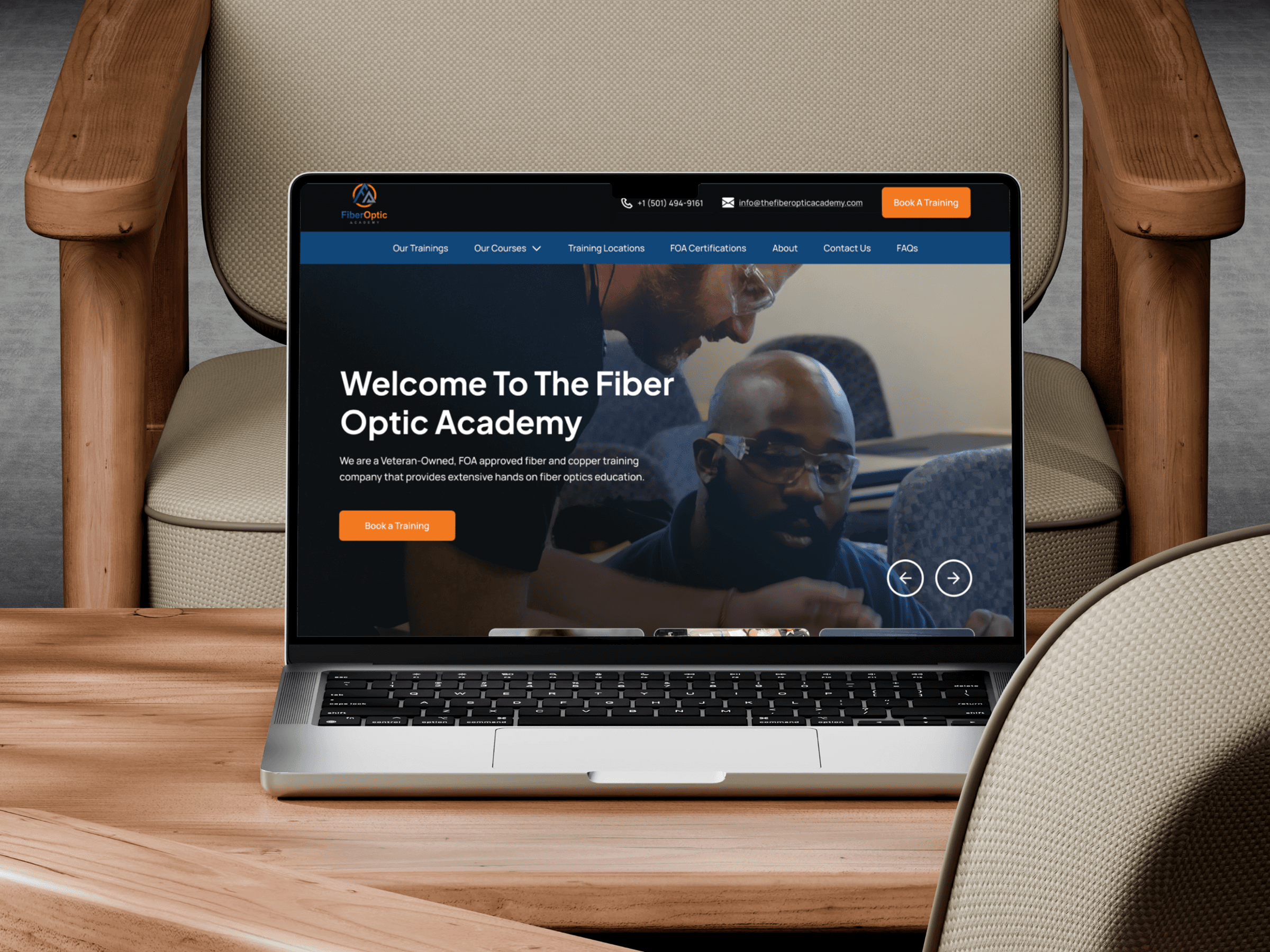
Key Features Introduced: - Streamlined Navigation: Introduced a clear menu structure with categories for "Courses," "About Us," "Certifications," and "Contact." - Enhanced Course Pages: Added detailed course descriptions, student testimonials, and a prominent "Enroll Now" button. - Responsive Design: Ensured the site was fully responsive for desktop, tablet, and mobile users. - Personalized Experience: Added a "Recommended for You" section on the homepage to guide users based on their interests. - Trust-Building Elements: Integrated client testimonials, success stories, and certification seals prominently on the homepage.
Key Features Introduced: - Streamlined Navigation: Introduced a clear menu structure with categories for "Courses," "About Us," "Certifications," and "Contact." - Enhanced Course Pages: Added detailed course descriptions, student testimonials, and a prominent "Enroll Now" button. - Responsive Design: Ensured the site was fully responsive for desktop, tablet, and mobile users. - Personalized Experience: Added a "Recommended for You" section on the homepage to guide users based on their interests. - Trust-Building Elements: Integrated client testimonials, success stories, and certification seals prominently on the homepage.
Key Features Introduced: - Streamlined Navigation: Introduced a clear menu structure with categories for "Courses," "About Us," "Certifications," and "Contact." - Enhanced Course Pages: Added detailed course descriptions, student testimonials, and a prominent "Enroll Now" button. - Responsive Design: Ensured the site was fully responsive for desktop, tablet, and mobile users. - Personalized Experience: Added a "Recommended for You" section on the homepage to guide users based on their interests. - Trust-Building Elements: Integrated client testimonials, success stories, and certification seals prominently on the homepage.

The Result
The Result
Quantitative Results: - 40% increase in course enrollments within the first 3 months post-launch. - 25% improvement in mobile user engagement (time spent on site). - Bounce rate reduced by 20%. Qualitative Results: - Users reported a significantly easier time finding courses and enrolling. - Positive feedback on the modern and professional design.
Quantitative Results: - 40% increase in course enrollments within the first 3 months post-launch. - 25% improvement in mobile user engagement (time spent on site). - Bounce rate reduced by 20%. Qualitative Results: - Users reported a significantly easier time finding courses and enrolling. - Positive feedback on the modern and professional design.
Quantitative Results: - 40% increase in course enrollments within the first 3 months post-launch. - 25% improvement in mobile user engagement (time spent on site). - Bounce rate reduced by 20%. Qualitative Results: - Users reported a significantly easier time finding courses and enrolling. - Positive feedback on the modern and professional design.

PORTFOLIO
CHECK OUT SOME MORE
CHECK OUT SOME MORE
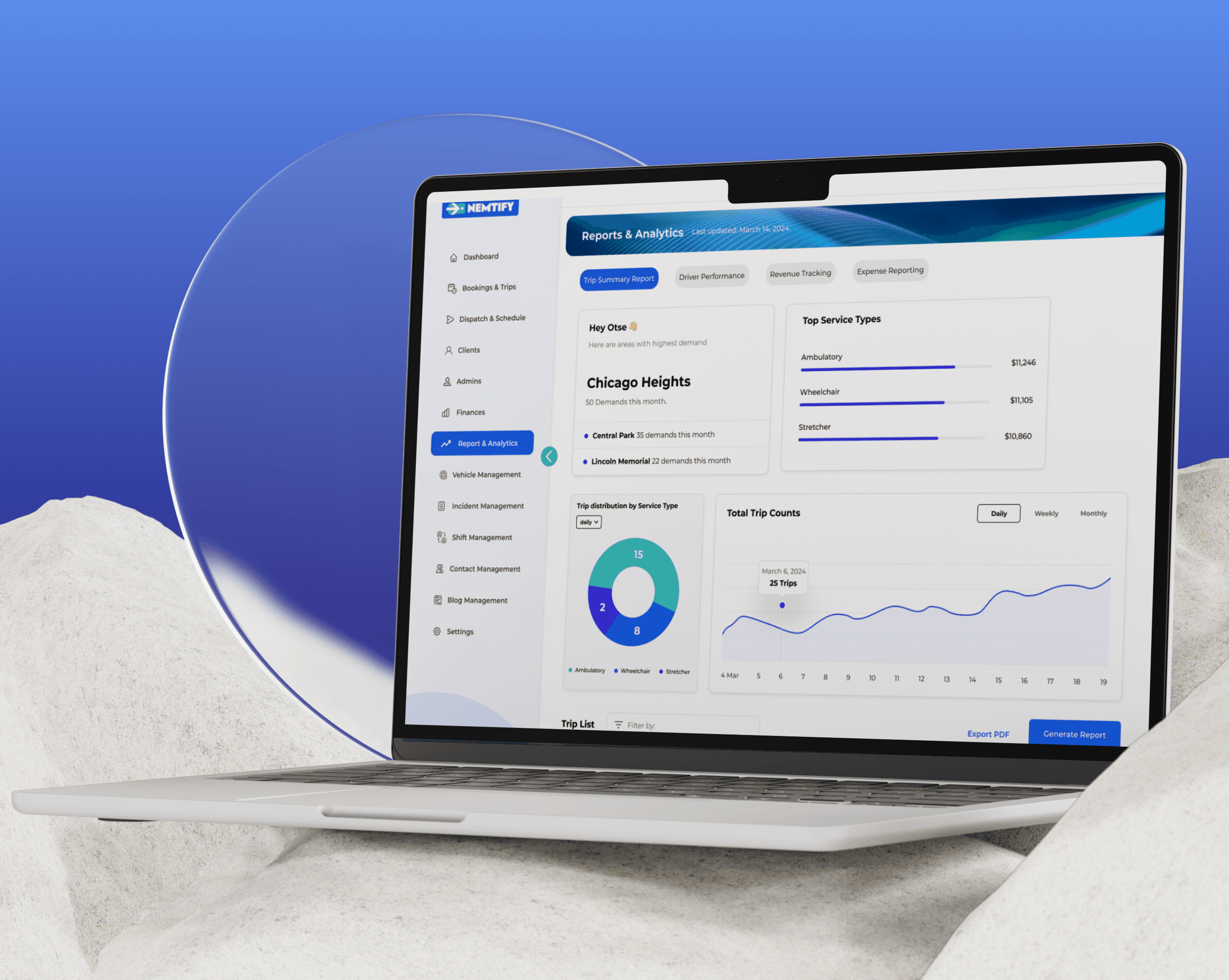
NEMTIFY
UX Research & Design
Product Documentation
Product Discovery
Figma
B2B SaaS for Medical Transportation Service Operators
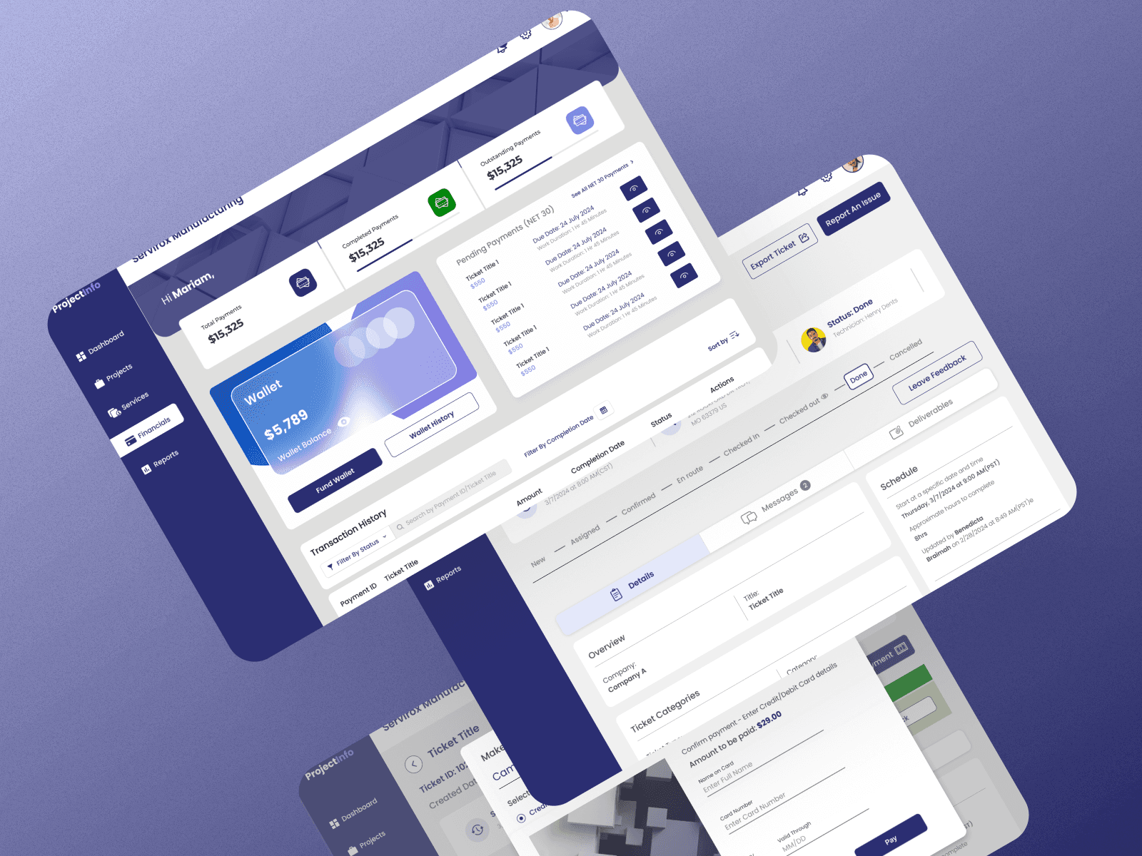
ProjectInfo
Product Design
B2B/B2C SaaS design
Product Thinking
AI optimized workflows
Interactive Prototyping
HAVE A PROJECT
IN MIND ?